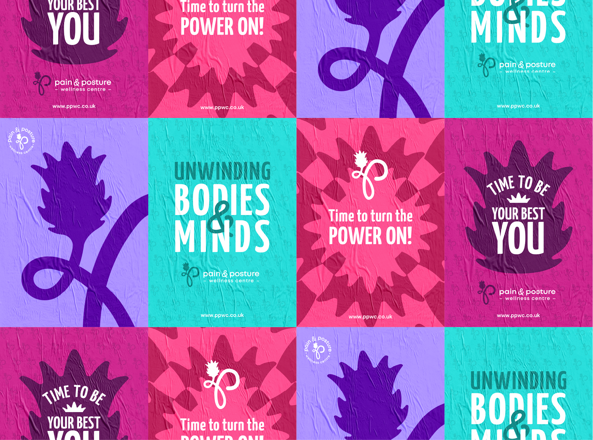
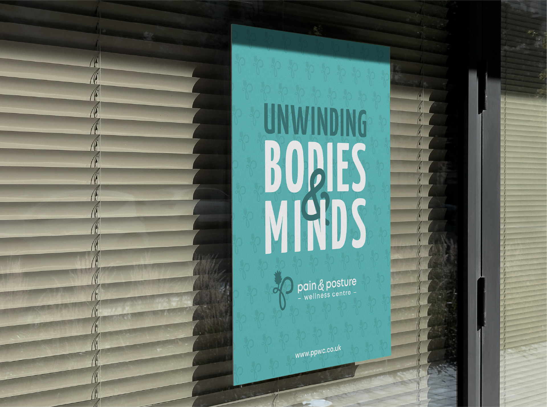
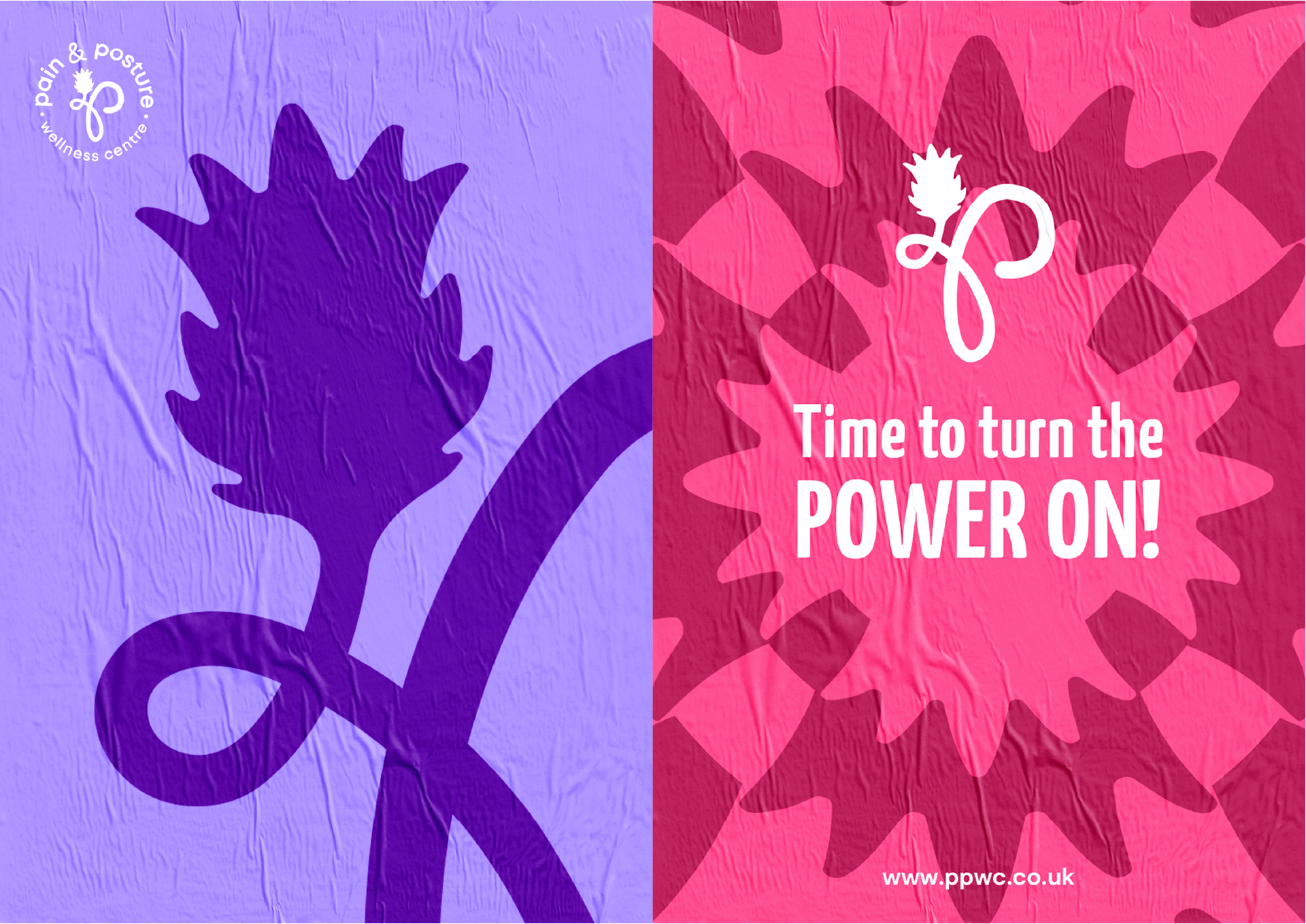
Inspired by the body’s natural ability to realign, heal, and strengthen over time, the identity reflects a sense of movement, balance, and transformation. The design reinforces the idea that true wellness is achieved through subtle, consistent correction—where precision, care, and expertise come together to restore harmony and improve quality of life.
Service (s)
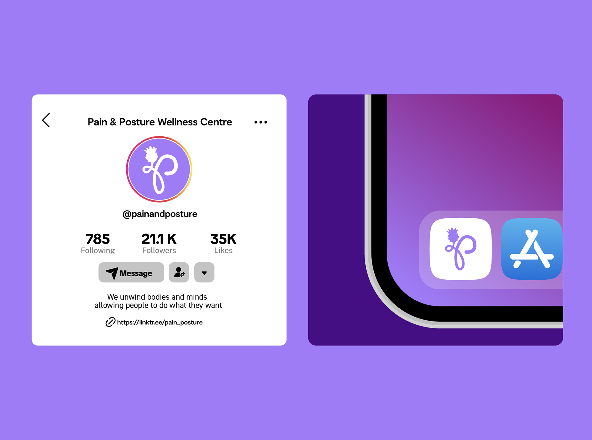
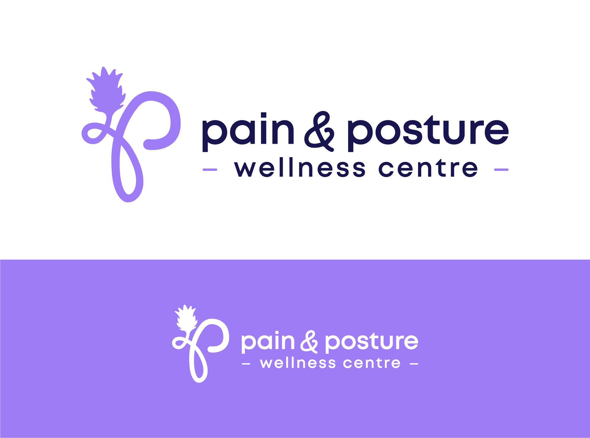
Logo, visual identity
Logo, visual identity
Year
2025
2025
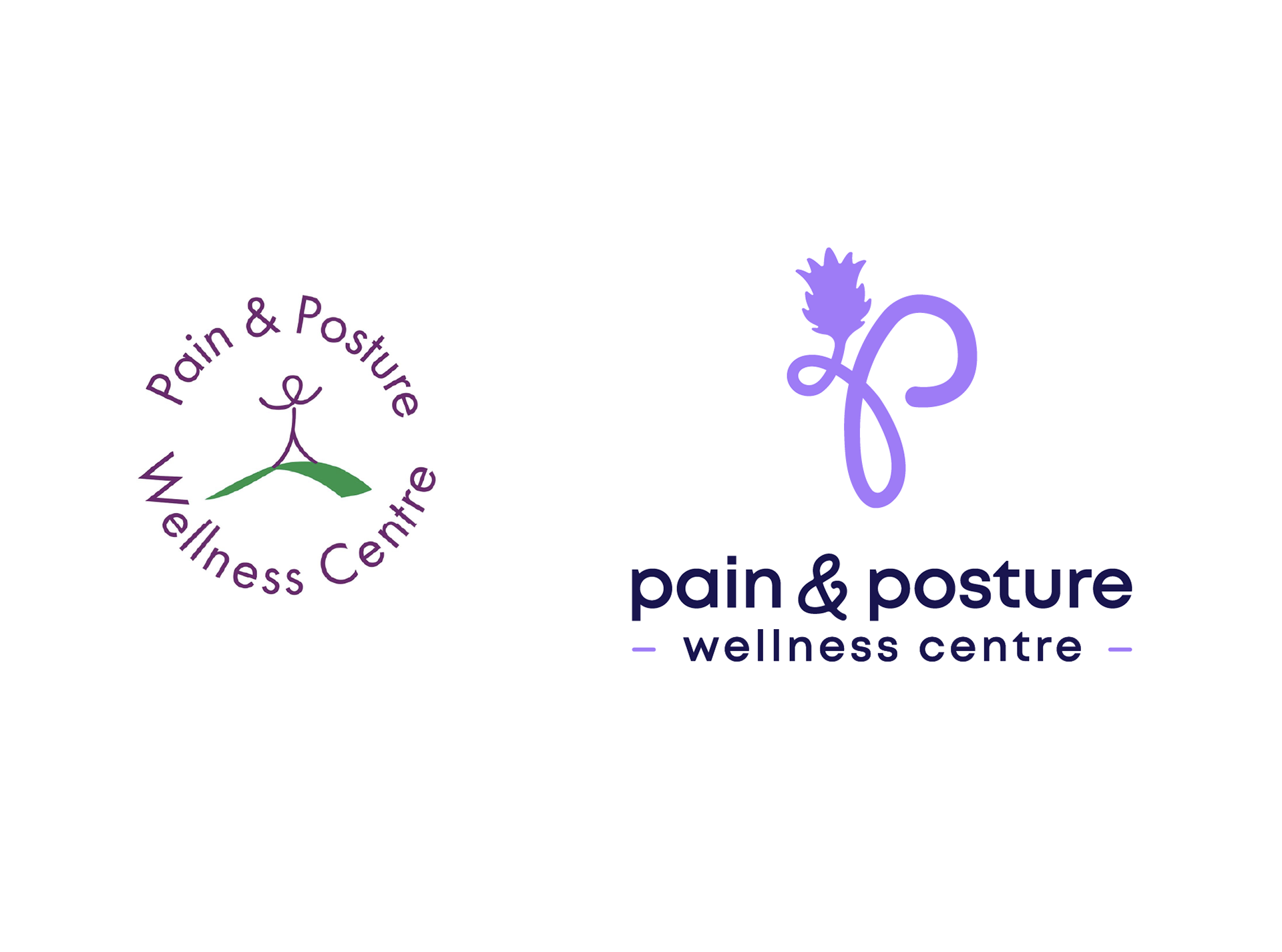
The Concept
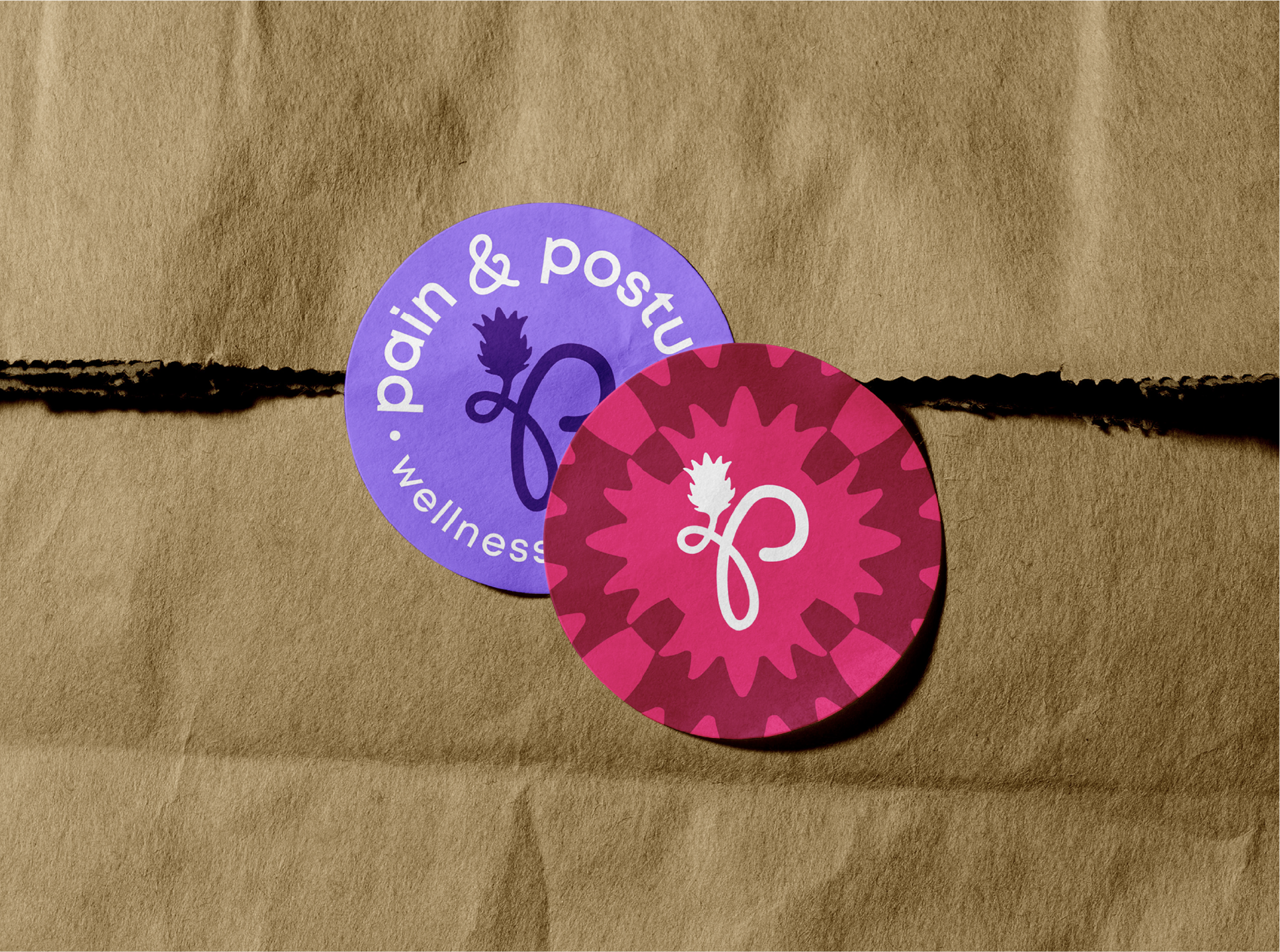
The logo concept centres around an unwinding “P,” symbolising realignment and release, paired with a thistle to root the brand in strength, resilience, and its Scottish identity.